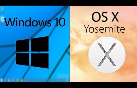
Microsoft has had several challenges in the past few years. Although the company makes more money compared to some European countries, the main problem they have had is that of relevance. Coming later this year is the all-new Windows 10 which is designed to bridge this gap. In 2014 at a developer event, Microsoft unveiled the new operating system. On Wednesday 21 January, at a consumer preview, the company unveiled more of their refined product which was compared to Mac OS X Yosemite. In early August or late July, the final version of Windows 10 is expected.
2. The Desktop
Yosemite's desktop version was visually changed with a completely new flat look, although functionally it is identical to earlier version of OS X. You can get the Dock from which you may launch apps or open folders and files via Stacks. Mission Control will let you see what documents and apps are open, allowing you to switch between them.
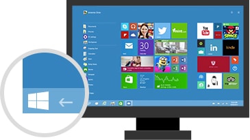
On the other hand, Windows 10 brings back the Start menu which was in earlier versions of the operating system. The Start menu features updated graphics which may go full-screen but remains as functional as ever.
However, Microsoft is not about to give up the Live Tile concept which irked many users. For the desktop users, the Start Menu has changed into a genuine hybrid; half is traditional files/app listings, similar to the one in Windows 7 while the other half is Live Tiles. This may include a news tile that shows constantly scrolling headline as well as the Mail app and the Calendar among others.
3. Notifications
The Notification area which is significantly boosted in Yosemite will let your OS X and apps tell you important stuff. In addition, it provides the widgets home which show information such as weather or lets you perform quick tasks. It works harmoniously meeting every need that the user might have.
In 2014, Windows Live Tiles had not evolved since Windows 8. Unlike the Yosemite's notification area which is an information hub and an app launcher, the Live Tile area on Windows 10 comprises of dumb icons. For instance, the Mail tile normally shows the number of the unread messages, instead of their subject excerpts or fields. The Calendar tiles shows only the date and day. The Skype tile is an app icon, instead of a chance to jump into a voice chat or respond to a text quickly.
In addition to the consumer preview, Windows Phone's Action Center will come to the desktop in Windows 10. The operating system will offer quick actions, notifications and more, same to the Notification area in OS X Yosemite. In this Action area apps, the system and Notifications will be able to effectively communicate to the user.
4. The Task View
Yosemite firms-up Apple's goal of ensuring that apps run either as full-screen or traditional program windows. This is done by switching the maximizing button to the full-screen option. In courtesy of Spaces and Mission Control, working full-screen in apps makes life easy on smaller screens like those on MacBooks.
As in the update of Windows 8.1, "Metro" apps are designed for tablets full-screen start-up in Windows 10. It has a traditional title bar and does not overlap the taskbar which is at the bottom. Just like any window, some have fixed dimensions while others can be resized. At the left side of the title bar, there is a new menu button. This provides quick access to features that are found on the Charms' bar in Windows8-like settings. The full-screen approach works well, though it has that feel of emulation where you feel like you are using different computers.
Microsoft has essentially copied the Mission Control and Spaces concepts from OS X. The new Task view will let you switch between apps running on full-screen. You can also switch or create new desktop spaces.
5. Mobile Integration
Apple has maintained that two varied operating systems are quite necessary: one for computing and the other for mobile devices. Windows 10 will basically run on PCs, Xbox One, smart-phones and tablets. There will be no more different version of Windows for the phone. This means that the same applications will be available on every Windows 10 device.
Microsoft is tailoring the operating system to devices 8-in and above, with a slight different version for small screen tablets and Windows phones. This mobile version of Windows 10 is not a successor to the Windows Phone 8; it is the same operating system that runs on PCs.
6. Continuity Features
While every operating system is unique, Apple offers several features which unify both iOS and OS X. Apple has unified most of these features under the banner of Continuity and they include Airdrop.' This is boosted in Yosemite to enable you to share files between desktop computers and iOS devices.
Since Mavericks in 2013, users were able to send the SMS-messages to the other iCloud users on Mac. However, now a user can text anyone from Mac, regardless of the smart-phone he/she is using. Also new in the Yosemite operating system is the ability to receive and make calls on the Mac using an iPhone number.
7. The Apps and Apps Store
Apple has tried to unify work patterns across Macs and iOS in Yosemite. It allows apps to share data instantly between iOS and OS X, since in Yosemite documents can be accessed on any device and stored on the iCloud Drive.
The App Store concept was introduced by Apple to the world and was immediately copied by Microsoft and Google. Across all devices, Windows10 unifies the Windows Store. Mobile and desktop versions of Windows10 share APIs, making it easier for the developers to create one single app which will work on desktop computers and tablets.
8. The Internet Browser
The Safari browser gained a lot in Yosemite; including a new look, providing a significant speed boost and more space for the browser tabs. Safari's developers have added useful tools such as shared links for staying updated on your favorite sites, reading list for offline browsing and tweeted links.
However, Windows 10 will have a new browser with the code name Spartan. The browser will have a new rendering engine which is compatible with today's web.
9. Mail
Apple's Mail in Yosemite offered new features including Mail Drop. This eliminates the hassle of sending large files as Apple looks after the download and upload of files over 5MB. On the contrary, the default email application on Windows10 is Mail, a tablet application which is quite basic.
10. The Search Function
One of the OS X's greatest features is the Spotlight search tool. It provides access to every type of data making the whole concept of the file system redundant. You may use Spotlight to start apps, open files, search emails and much more. It has also been expanded in Yosemite to perform ultra-rapid web, App store, map, and Wikipedia searches. Windows10 has a new search icon which is on the task bar near the start button.
Basing on this OS X Yosemite vs Windows 10 preview, there is little in Windows 10 to be excited about. On the other hand, Yosemite supersedes it in almost every way. Although Windows 10 has some adjustments, it still feels like a slightly improved version of Windows 8. In contrast, Yosemite has been able to demonstrate how an operating system ought to evolve, as it is able to meet the needs of its users in a unique way.


